What Does a Fear-Based Health-Care System Produce?

In my last post1, I shared a conversation with a doctor friend who told me that from the very beginning, doctors are trained to lead with fear. The system she works in measures speed, volume, and billing. Not outcomes. Not whether anyone got healthier.
That conversation left me with a question: What does a fear-based healthcare system actually produce?
I want to be clear. I am not a healthcare expert. I’m not going to pretend to understand all the complexities of this system. This is me swimming in the shallow end of a very deep pool. I am looking at some numbers that caught my attention and only scratching the surface.
What I found was hard to ignore and I wanted to share.
The Spending
In 2024, the United States spent an estimated $13,432 per person on healthcare. That’s the highest in the world. Germany came in second at $7,383. The average for the other nine wealthy countries in this comparison was around $6,000.
We spend roughly twice as much as comparable nations.
The Outcomes
You might expect that spending twice as much would get you better results. It doesn’t.
The Commonwealth Fund compared healthcare systems across ten high-income countries in their 2024 “Mirror, Mirror” report. The United States ranked last. Dead last. We had lower life expectancy, higher rates of preventable death, and worse outcomes across nearly every category.
The countries that ranked highest? Australia, the Netherlands, and the United Kingdom. And they spend far less than we do.
But here’s where it gets interesting.
The Paradox
The Commonwealth Fund measured five different areas of healthcare performance. Here’s what each one means:
Access to Care: Can people get and afford healthcare when they need it? This includes whether cost prevents people from seeing a doctor, whether they have a regular place of care, and whether they can get appointments and after-hours care when needed.
Care Process: When people receive care, is it high-quality? This looks at prevention, safety, coordination, patient engagement, and whether care reflects patient preferences. It measures whether the care delivered includes features that experts consider essential to quality.
Administrative Efficiency: How much time and money are wasted on paperwork, billing disputes, and bureaucracy? This captures the challenges doctors face dealing with insurance claims, the burden of reporting requirements, and patients’ time spent on medical bill disputes.
Equity: Do low-income people have similar access and care experiences as higher-income people? This measures whether income level affects someone’s ability to get care, pay for it, and receive respectful treatment.
Health Outcomes: Do people live long, healthy lives? Are deaths from preventable and treatable causes low? This includes life expectancy, excess deaths from the pandemic, and deaths that could have been avoided through effective healthcare.
Now here’s the paradox.
The US actually ranked second on Care Process. Second. That’s the quality of care delivery itself. Prevention, safety, coordination, patient engagement.
When people can access care, we’re good at delivering it. The medicine itself isn’t the problem.
We ranked last on Access to Care. Last on Health Outcomes. And second-to-last on Equity and Administrative Efficiency.
The care is good. The system blocks people from getting to it.
The Full Picture
Here’s how all ten countries compare. The numbers in each domain column show where that country ranked (1 = best, 10 = worst).
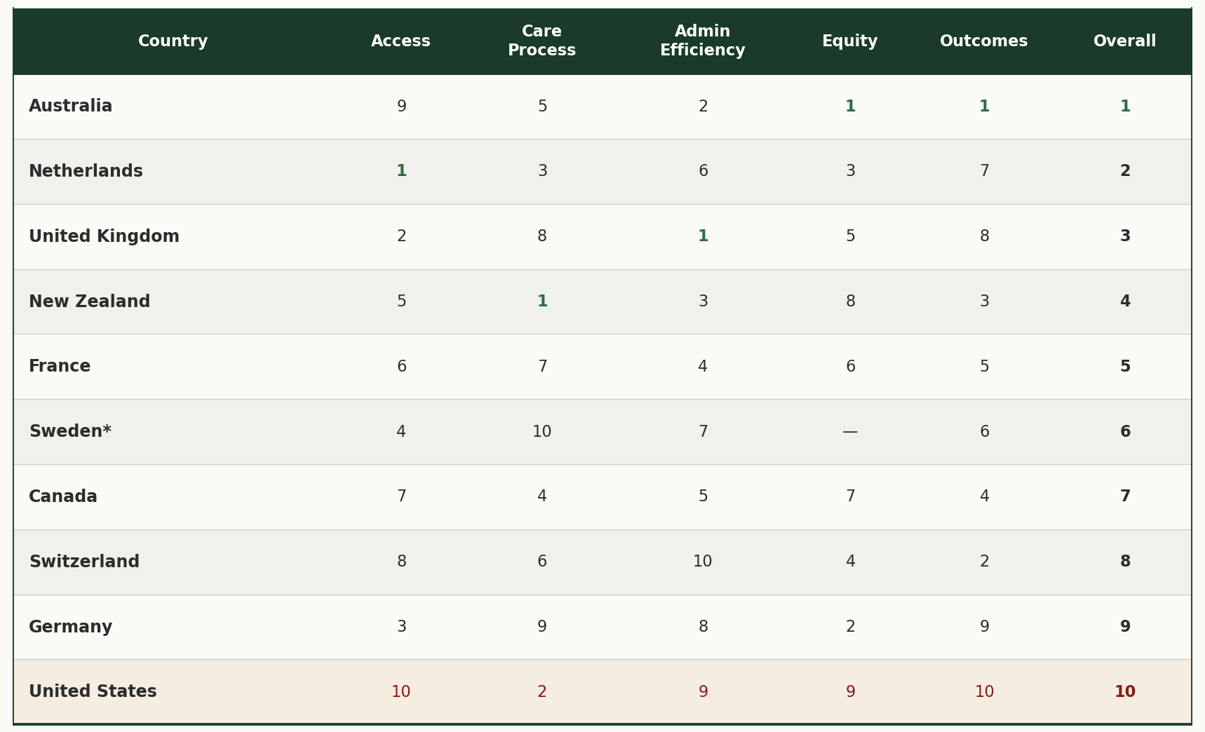
*Sweden’s overall rank is based on four domains instead of five. Sweden’s privacy laws prevent the collection of income data in surveys, so the Equity domain could not be calculated. The US ranks 9th in Equity because Sweden is excluded, making it last among the nine countries measured.
Source: Commonwealth Fund, “Mirror, Mirror 2024: A Portrait of the Failing U.S. Health System,” September 2024.
Look at the US row. We’re second in Care Process. But last in Access, last in Outcomes, and last (among countries measured) in Equity. And we are second to last in Admin Efficiency. The system delivers good care, albeit inefficient, to people who can get it. But it blocks too many people from getting there.
So, what explains this gap? The US spends the most and ranks last. Other countries spend less and rank higher. Is there something fundamentally different about how these systems are designed?
To find out, I looked at three other factors: how much each country spends, how unequal their incomes are, and what type of healthcare system they use.
Additional Context: Spending, Inequality, and System Design
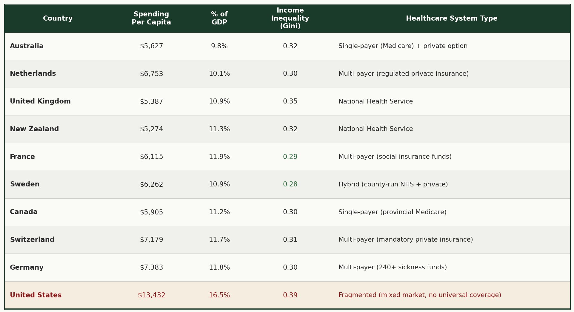
A note on income inequality: The numbers in the "Income Inequality" column are called Gini coefficients. Think of them as a score from 0 to 1. Zero would mean perfect equality, where everyone has the same income. One would mean perfect inequality, where one person has everything. The higher the number, the greater the gap between rich and poor. These figures use disposable income after taxes and transfers, calculated consistently across all ten countries using OECD methodology, making them an apples-to-apples comparison. The US has the highest income inequality of all ten countries (0.39). Sweden has the lowest (0.28).
Sources: OECD Health Statistics 2023/2024; OECD Income Distribution Database 2021-2022.
The Design
Look at the last column of that table. The “Healthcare System Type.” Every other country has achieved universal coverage. The specific model varies. Australia uses single-payer. Germany uses regulated non-profit sickness funds. The UK runs a national health service. But they all share one thing in common: everyone is covered.
The United States is the only country that maintains separate systems for separate classes of people. The only one that relies on voluntary private insurance as the primary mechanism. The only one that allows for-profit insurance companies to deny coverage.
As T.R. Reid noted in the PBS Frontline documentary Sick Around the World (2008):
“The United States is unlike every other country because it maintains so many separate systems for separate classes of people. All the other countries have settled on one model for everybody. This is much simpler than the US system. It’s fairer and cheaper, too.”
The Wealth Supremacy Connection
The pattern is hard to miss. The country with the highest income inequality also has the worst healthcare outcomes.
This reminded me of something I explored in an earlier post, “What is Money?”2 In that piece, I shared a quote from Marjorie Kelly’s book, The Making of a Democratic Economy, that has stayed with me:
“In a democratic society founded on the truth that all persons are created equal, we have permitted in our midst an economic system based on the directly contrary principle that wealthy persons matter more than others. Deserve greater rights. Justifiably wield greater power. Rightly enjoy greater voice. Are due greater deference. And possess a limitless right to extract from the rest of us.”
From my perspective, the US healthcare system operates on wealth supremacy. If you’re wealthy, you get better care. You live longer.
The data backs this up. A 2016 study led by economist Raj Chetty found that the richest 1% of American men live 14.6 years longer than the poorest 1%. For women, it’s 10.1 years. From 2001 to 2014, the top 5% of earners gained about 3 years of life expectancy. The bottom 5% gained essentially nothing.
Being rich in America buys you 10 to 15 more years than being poor in America.
The system is working exactly as designed. For the wealthy.
Except When It Isn’t
A study published in April 2025 in the New England Journal of Medicine found something interesting. Even the wealthiest Americans have shorter lifespans than their European counterparts.
The researchers, led by Irene Papanicolas and Sara Machado at Brown University’s School of Public Health, compared survival rates across wealth levels in the US and 16 European countries. They tracked more than 73,000 adults aged 50 to 85 over a 10-year period.
Their finding: The wealthiest Americans have survival rates on par with the poorest Europeans in western countries like Germany, France, and the Netherlands.
Let me say that again. The richest Americans die at about the same rate as the poorest Germans, French, and Dutch.
As Papanicolas noted:
“The findings are a stark reminder that even the wealthiest Americans are not shielded from the systemic issues in the US contributing to lower life expectancy.”
The system built on fear and wealth supremacy can’t even deliver for the wealthy what systems built on equity deliver for everyone.
What I’m Sitting With
I’m not here to prescribe solutions. I don’t have the expertise for that.
But I am sitting with a lot of thoughts and questions.
In a fear-based system, even the “winners” seem to lose compared to systems built on something else. Fear hoards. It protects. It separates people into classes and rations care based on ability to pay.
The other systems don’t operate that way. They start from a different premise. Everyone is covered. Everyone matters.
And it turns out that sharing actually produces better outcomes for everyone. Including those who have the most to share.
This isn’t just about healthcare. It’s about the fundamental question of how we build systems. Do we build them to serve the haves at the expense of the have-nots? Or do we build them to care for everyone?
The data suggests the first approach fails even on its own terms.
This is the second post in a series exploring healthcare through the lens of love and fear. The first post, “Trained to Lead with Fear,”. Next, I’ll share my own experience navigating this system as a self-employed person. The fear that almost stopped me from pursuing my dreams. And the cost of living without the safety net that comes with traditional employment.
Learn more about the adventure at www.heart-strong.org
Sources
Healthcare System Comparisons:
Commonwealth Fund, “Mirror, Mirror 2024: A Portrait of the Failing U.S. Health System,” September 2024. Link
Peterson-KFF Health System Tracker, “How does health spending in the U.S. compare to other countries?” 2024.
OECD Health Statistics 2023/2024
Income Inequality:
OECD Income Distribution Database, 2021-2022 data (disposable income after taxes and transfers)
Healthcare System Design:
T.R. Reid, Sick Around the World, PBS Frontline, 2008. Link
Wealth and Health in the US:
Raj Chetty et al., “The Association Between Income and Life Expectancy in the United States, 2001-2014,” JAMA, April 2016.
Wealth and Mortality US vs. Europe:
Sara Machado, Ilias Kyriopoulos, E. John Orav, and Irene Papanicolas, “Association between Wealth and Mortality in the United States and Europe,” New England Journal of Medicine, April 2, 2025. DOI: 10.1056/NEJMsa2408259
Wealth Supremacy Quote:
Marjorie Kelly, The Making of a Democratic Economy: Building Prosperity for the Many, Not Just the Few (Berrett-Koehler Publishers, 2019)
https://adventure.heart-strong.org/p/trained-to-lead-with-fear
There’s an approach that people can use to think about spending called zero-based budgeting. Start as if from scratch and see what you’d include. Not stay beholden to what’s not working. Even if you don’t literally do it, just the mental exercise of questioning what we’re getting for what we spend is valuable.
Very interesting read Jeremy. Thank you for sharing all the research and thoughts!! ❤️